Video modal
Accelerating Ahead with a Bold New Rebrand
April 9th, 2025

Why Now? The Need for Evolution
The leather industry is undergoing a transformation. New competitors, shifting consumer expectations, and a rapidly evolving sustainability landscape demand that brands not only stay relevant but lead the charge. PrimeAsia has always been a company that looks ahead, anticipating market shifts and setting new standards. Our rebrand is a natural step in that journey—an opportunity to reassert our position as the premier partner for global footwear brands.
Accelerate Ahead: Our Brand Idea and Key Pillars
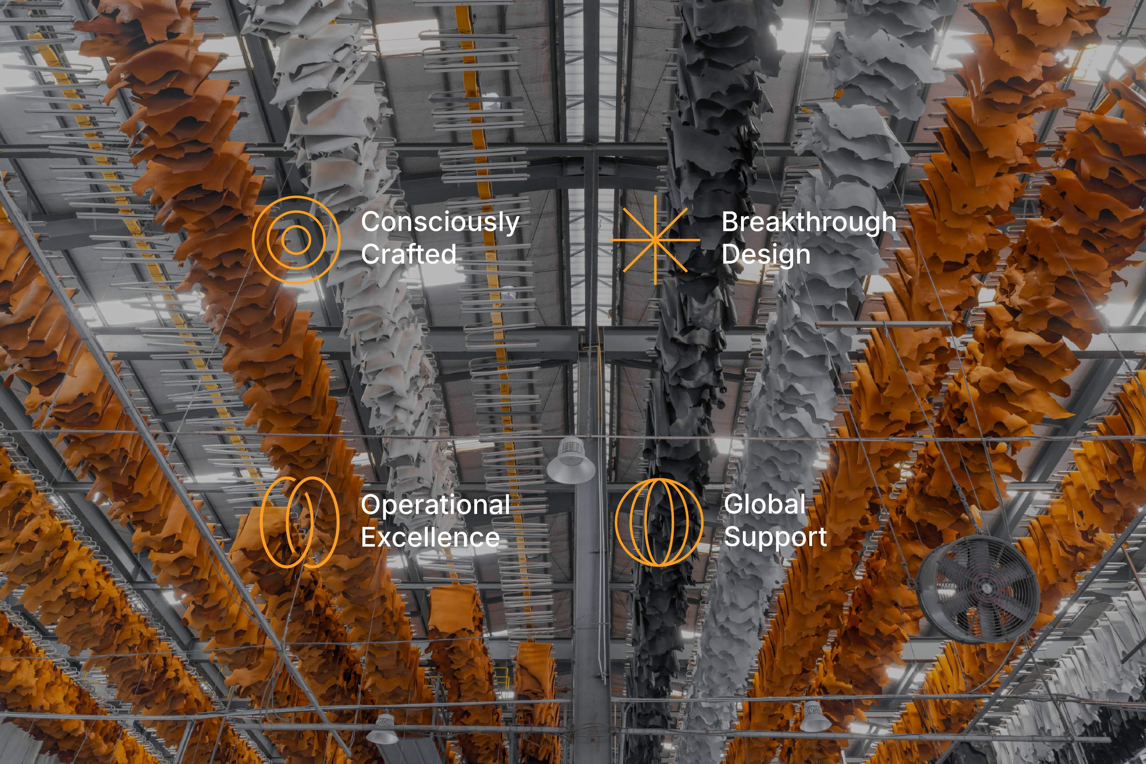
At the heart of our rebrand is "Accelerate Ahead", our guiding principle that drives everything we do. In an industry where momentum is critical, we ensure our partners are always moving forward. This philosophy is grounded in four key pillars:
Breakthrough Design: Pioneering innovation by blending aesthetics with functionality to meet evolving footwear trends.
Operational Excellence: Ensuring a seamless, reliable supply chain through advanced logistics, production capabilities, and a compliance plus approach.
Consciously Crafted: Leading with responsible leather solutions, aligning with science-based targets, and promoting circularity.
- Global Support: Offering a robust, customer-focused approach with local expertise across international markets.
PrimeAsia is more than just a supplier—we are a future-forward tannery that helps our partners gain and sustain momentum in a competitive industry.
The Design Evolution: Honoring the Past, Embracing the Future
For over three decades, our previous logo stood as a trusted symbol of quality, reliability, and craftsmanship. It was a strong representation of our legacy, but as we move forward, we needed a visual identity that aligns with the momentum and innovation driving our business today.
The new logo is a modern refinement of our brand. The clean, streamlined wordmark reflects our contemporary, global presence while maintaining a professional and bold stance. The two-dot insignia, a key element from our original design, remains as a symbol of precision, balance, and partnership—values that continue to define PrimeAsia.
Beyond just a new logo, our rebranding extends into typography, colors, and artistic direction. Our refreshed color palette, featuring bold blues and vibrant yellows, reinforces our commitment to energy, innovation, and trust. The new typography creates a balance between sophistication and accessibility, ensuring our communications feel both premium and approachable.
Most importantly, our design evolution is not just about aesthetics—it’s about creating a flexible, multi-platform brand identity. Whether on digital screens, product labels, or trade show displays, our new branding ensures consistency, clarity, and a strong, recognizable presence in the industry.


